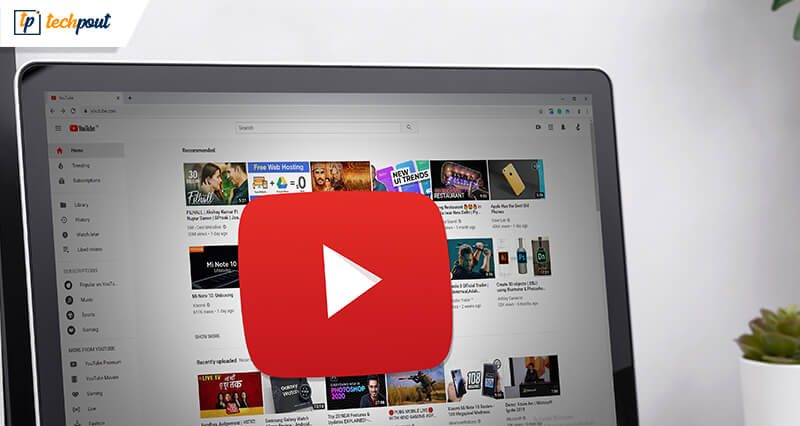
YouTube Homepage Brings Useful Features To Desktop and Tablets

The world is excited about the redesigned Homepage of Youtube. The updated design will boost new features and plans, which includes a fresh viewing experience on the Homepage.
The makeover is uniquely designed to provide a hassle-free experience to its users. It comes with bigger thumbnails and an advanced UI, making it easier for the users to discover videos. Among all things, you also get to see a more extended video title “Add to Queue” option along with a few extra channel icons. Some content shelves have, however, been removed for easy navigation.
The redesign is focusing more on Desktops and tablets currently; for iOS and Android devices, it is also planning to further roll updates in the future.
Here’s what to will get with the updated design of Youtube.
YouTube Homepage Makeover | Useful Features For Desktop and Tablets
1. Easy Search Mechanism
The fresh look of Youtube comes with bigger thumbnails, higher resolution preview, longer video titles, which means more details and information about the video that you are watching. Unlike the initial layout where the videos were divided into rows based on their category, the redesigned screen provides a full-page grid of recommended videos.
Along with this, you will also find a separate horizontal section showing music remix, breaking news, and many more.
2. Customize Your Next Watch with the “Add to Queue” Feature
This feature comes with a lot of benefits for frequent Youtube watchers. With the newly introduced “Add to Queue” feature, you can now queue your next song effortlessly while you enjoy your current music piece. The button is available on every video thumbnail.
You can also choose to use the “Add to Queue” from the three-dot menu available on the main page. The queue is temporary, and the moment you close the browser, it will disappear, however, the “Watch playlist: option will help you save a list for your next visit.
Also Read: YouTube To Roll Out Separate Site for Kids
3. Channel Icons for Recognizing Your Favorite Creators
The main home page now comes with channel icons, which makes it easier for you to recognize your favorite music creators and preferred videos. This move is also beneficial for the creators and will give them more visibility.
4. Don’t Recommend Option
If you wish to tailor your Homepage by limiting the options for you, “Don’t recommend option” is specially designed for this purpose. Once you enable this option, Youtube will stop recommending your videos coming from a specific channel.
Using this feature is quite simple. Just open the three-dot option and open the “Don’t recommend option” from it. Once done, Youtube will stop recommending videos from a particular channel.
5. Refine and Customize Your Homepage
Although the feature is currently available on Youtube Android apps, it is yet to be released for tablets and desktops. With it, you will be able to choose your favorite options and personalize your search results for a better experience.
The updated and freshly made redesign has already started rolling up on computer desktops along with iOS and Android tablets. Youtube is also planning to roll it across various smartphones shortly.


